media

All posts tagged media

Animation music video #1

Published November 6, 2013 by fernebryan

http://http://www.youtube.com/watch?v=XWrhrrF-em0

What do I like about it?
I like the slowly built up images to create a story, I also like how original the video is and the almost dark humour behind it. The plot was simple but the images looked like they took ages as it’s a 4 and a half minute video. Also at 2:40 minutes it makes it feel 3D, it’s really clever.

Who created it and when?
Sb9014 on the 12th September 2007.

What effects have been used?
It uses close up shots and panning is also involved. It does link to the beat of the song. It looks as if it is printed pictures against a 2D background to create a cartoon effect. It includes an average contrast until the end it begins to appear darker. It has an almost 1970’s filter on it as if a slightly vintage appearance, the colour range tends to stay on the basic side including dark colours such as a dirty cream, blacks, navy blues and purples. It has a collage effect to it as if it’s school book or bits of paper at the start.

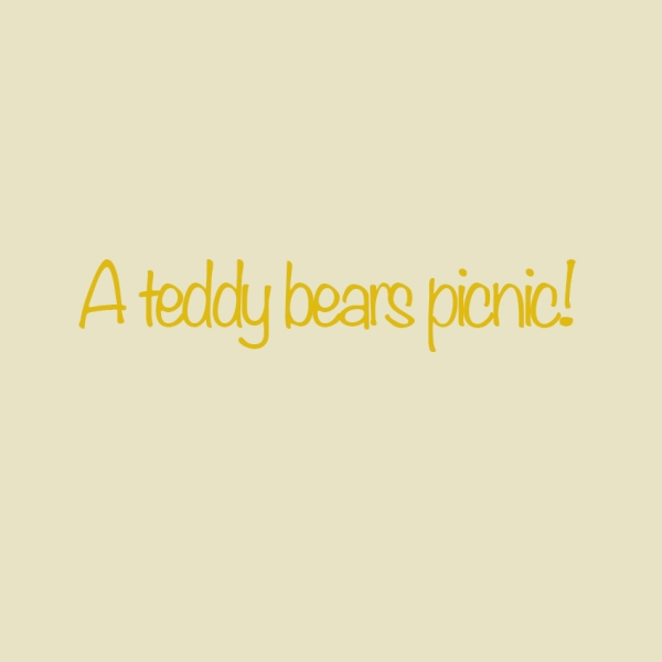
This is my 2D version of my title in different colours…

Published September 20, 2013 by fernebryan

This is my 2D version of my title in different colours...

I chose yellow and gold colours, so that they not only stand out for the children, but also are the same colours as a teddy bear. It’s very simple so will appeal to family’s as well. I done the exclamation mark to add excitement to the title as I felt it would attract more people to read if, if it was alerting. I think the background compliments the gold colour of the font, and it’s clear to read and easy to understand.

Poster design review:

Published September 6, 2013 by fernebryan

Image

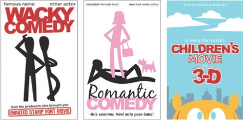
The poster on the far right is my favourite for my theme Teddy Bear Picnic! I think it’s very cute and will capture children’s attention and draw their eyes to the poster. It’s very simple yet bright and the parents will look at it too.

Image

This poster is interesting and intrigues the observer to read the poster because it’s using direct address and this can be appealing. The down side is, I could never be bothered to walk over to get close to it…as i’m lazy. This problem could occur with the unfit, elderly and lazy people.

Image

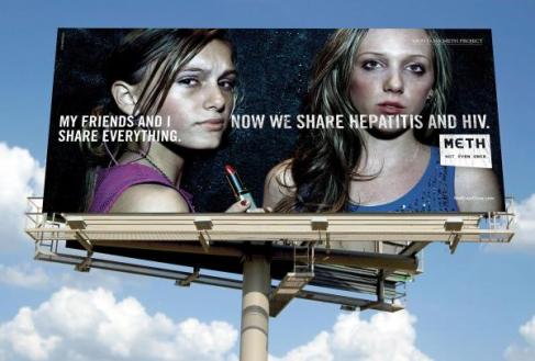
This poster is interesting as it’s set out as a picture of a poster, as the actual poster! This is original and a very creative idea. This will stand out as it is different and the words is very simple, one powerful sentence is easy to read and still has a good effect.

Image

like the design of this poster because it makes you want to read it. When people see the letters getting smaller they will want to see if they can read it to the end…the only bad thing is some people won’t be able to read it. However the colours are very simple and bold.

Bastille-Tour-Poster-March

This poster is interesting because the guy in the poster is running a