Sunflower man: Updated
Published May 7, 2014 by fernebryan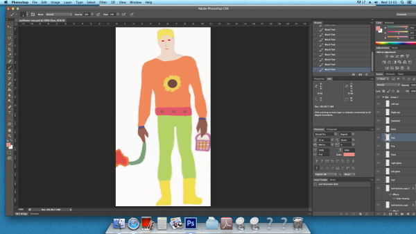
I used the pen tool to draw around Sunflower Man’s features and clicked control and left clicked inside the bit I just drew around. I filled the path in then selected the colour I wanted to fill with. Sometimes I would click colour then go and click on the body part so that it stays the exact same shade and colour. After clicking OK I then deleted the path and it left me with a filled in character which was more cartoon like. However, the contouring is gone so looks less 3D.
The sunflower man: Updated
Published April 30, 2014 by fernebryan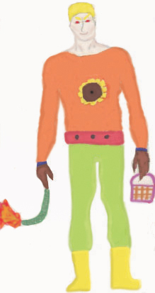
The Sunflower man
Published April 30, 2014 by fernebryan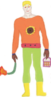
Sunflower man: Final touches
Published April 30, 2014 by fernebryan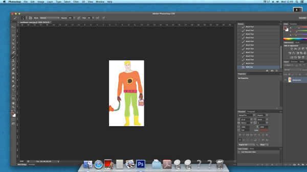
I finished colouring in with the brush tool and added a white background. I attempted to contour and highlight areas to make it look slightly more 3D, however, I still need to make it appear more 3D and define some more features.
Sunflower man: Final touches
Published April 29, 2014 by fernebryan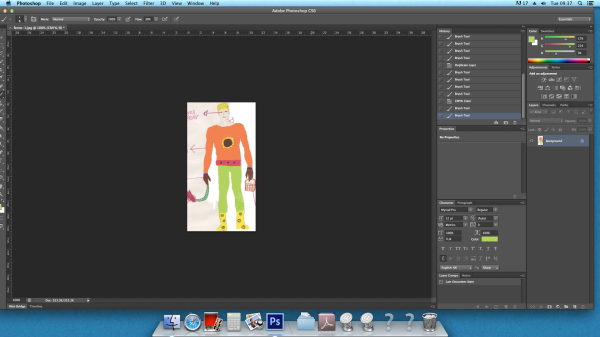
I began to colour in my characters figure using the paintbrush tool and then clicking on the colour I wanted for each body part. This gives the drawing a more animated touch and will give a 3D effect when i’ve shaded it. I also rubbed out any of the annotations that I made, then realising I could of just put a white rectangle over the image and moved the layer so it was underneath…
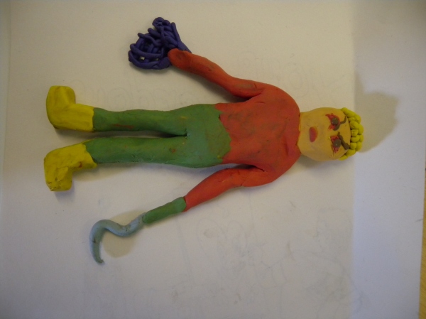
Superhero pose manipulated:
Published April 25, 2014 by fernebryan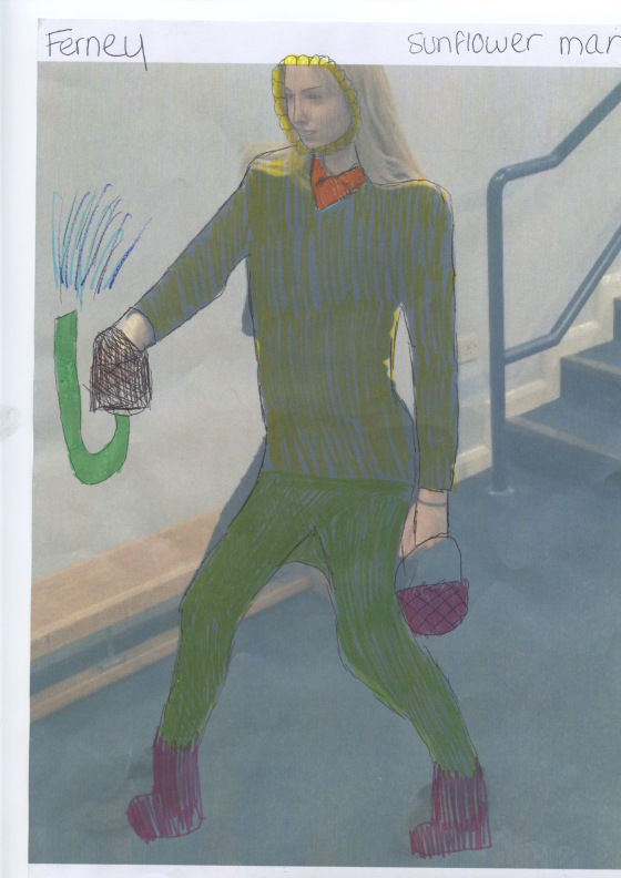
This is a student in my class who I asked to pose like my superhero and I printed it and drew over it to adjust the character so it looked for like Sunflower Man. Here is the finished piece. I used coloured pens to create this overall representation of my superhero which is colourful.
Captain America poster analysis:
Published April 25, 2014 by fernebryan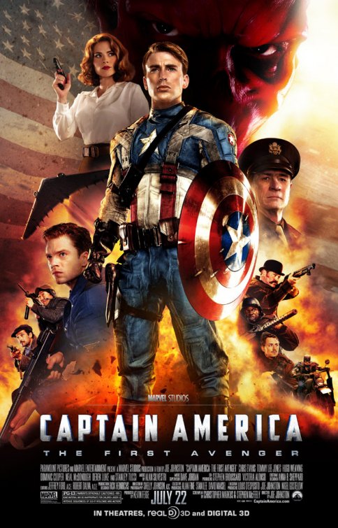
The captain america poster first presents who the main character is by the composition of the poster. He is the only person with a full body image, is the largest, most colourful and at the front of the poster. The American flag is in the background which shows it’s based in America as well as the obvious title ‘captain america’. This represent heroism and that he is a superhero not a villain as his pose is very strong and proud as well as the patriotic theme in the background and throughout, all the focus is on him. The fire highlights all the characters in the poster and shows who’s good and who’s bad as there are more shadows near the bad guys. The typography is very bold and large at the bottom to define the title of the movie. The tagline is ‘The first avenger’ which suggests he’s powerful and people follow him which indicates even more so that he’s a superhero. The genre comes across as action as the poster is action packed in itself which affects the mood to patriotic, strong and powerful which captures the viewers attention. The date of the movie release is bold which shows importance and catches your eye along with the actors names above it which aren’t as bold or clear as to the average passer byre is not important unless it’s a well known actor or actress. The colour scheme is very colourful which suggests anyone can watch it and it’s very action packed along with the fire at the bottom. The dirt of captain america’s suit also suggests the length of his battle against evil, his perseverance and how hard he fights.
Batman poster analysis:
Published April 25, 2014 by fernebryan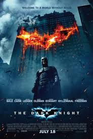
The batman poster, however, is far more serious and destructive. The background is darker and has lots of shadows which may indicate batman may or may not be a superhero or a villain which interests the viewer instantly. It shows that batman is the star of the movie because he’s standing in the centre which shows power, plus the composition of the poster and the way he is standing proves he is the main character and he is very significant. The lighting is poor and is very dark which creates a mysterious approach which will intrigue someone to look at the poster. The tagline ‘Welcome to a world without rules’ suggests the world is in a bad position and evil is approaching fast but is batman the person to stop this or is he the cause? This makes the reader question what is going on, getting them to watch it to find out. The bright orange explosion is the middle of the building immediately captures your attention and you begin to question why batman is just standing there when the building looks like it is about to collapse. This highlights the poster. This may suggest the genre is scary/horror/action because of the colour scheme of black and grey. The title of the film ‘The dark knight’ is near the bottom but with the highlighting batman logo behind i this catches your eye. Plus it’s in a different font and is very bright and bold. It lists the actors in the film along side credits and the releasing date of the film which are all various sizes, fonts and brightness dependant on the importance of the text. The clouds are grey and scattered which could portray a string of negative events which are about to take place. The crashing of the building and the weather could be a pathetic fallacy for the film and what the storyline has to bring.
Spider man poster analysis:
Published April 25, 2014 by fernebryan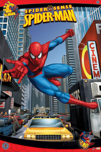
The background is in a busy city with tall buildings which lets the viewer know it’s in a main city, like New York. There’s a clear indication that spider man is the main character because he’s the largest image in the middle striking a pose. There;s a colour theme of red and blue which are child like colours to show it’s a film that suits a wide audience ranging from young to old and that the genre is action due to spider man’s pose and the colour of the poster. The title stands out because it’s in a unique font, bold and bright yellow which highlights the importance of the title. It’s right at the top in the centre so you cannot miss it. The common spider man phase ‘spider sense’ is at the top above the title along with a logo of spider man saying ‘web slinger’ which tells us straight away what it is about. This shows that spider man is significant to society because everyone’s taking pictures of him as he strikes his pose and everyone’s attention is on him and as there’s no violence, weapons or police you assume he’s a good guy. The layout is very colourful, fun and big images or words to show it’s an action packed movie. This gives of an energetic and heroic mood to the poster. There aren’t any shadows so you would perceive this is a good film about a superhero not a villain and he battles evil and fights for justice.
