The poster on the far right is my favourite for my theme Teddy Bear Picnic! I think it’s very cute and will capture children’s attention and draw their eyes to the poster. It’s very simple yet bright and the parents will look at it too.
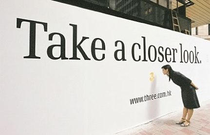
This poster is interesting and intrigues the observer to read the poster because it’s using direct address and this can be appealing. The down side is, I could never be bothered to walk over to get close to it…as i’m lazy. This problem could occur with the unfit, elderly and lazy people.

This poster is interesting as it’s set out as a picture of a poster, as the actual poster! This is original and a very creative idea. This will stand out as it is different and the words is very simple, one powerful sentence is easy to read and still has a good effect.

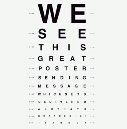
like the design of this poster because it makes you want to read it. When people see the letters getting smaller they will want to see if they can read it to the end…the only bad thing is some people won’t be able to read it. However the colours are very simple and bold.
This poster is interesting because the guy in the poster is running a